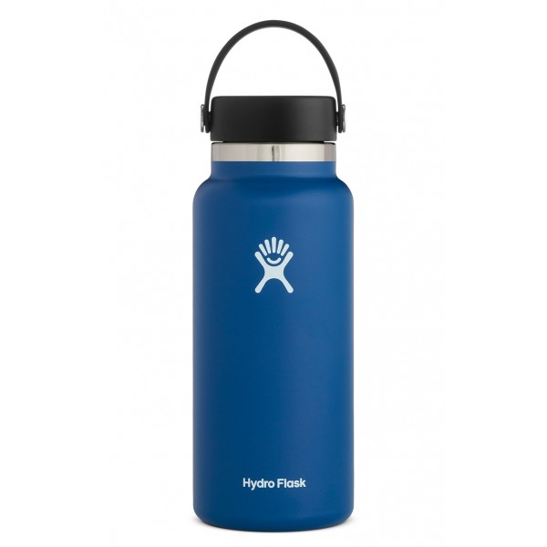
The Hydro Flask logo looks like a jumping person and gives a sense of refreshment, energy and joy. But has the Hydro Flask logo always looked like this or did Hydro Flask change their logo?
Hydro Flask have actually changed their logo:
Hydro Flask changed their logo in August, 2015. They simplified their logo image, making the lines bolder and less curved while keeping in the spirit of their original logo. They also changed their logo text font, opting for a simpler bolder font.
Original Logo vs New Logo
As you can see in the images above the new logo is extremely similar to the old logo.
It still has the jumping person with the smile and 5 strokes that seem to represent both hair and water splashes.
The character's middle part has been filled in and made a solid color and the new smile is symmetrical whereas the old smile was thicker on the left hand side and thinner on the right.
The old font was more eccentric and unique than the new font which is much more standardized.
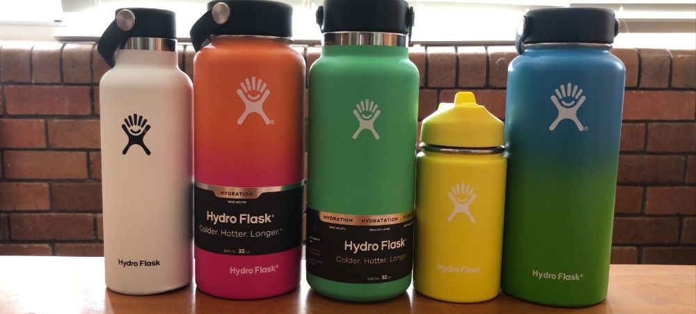
Hydro Flask started with just a couple's idea and 1,500 bottles shipped from China. The original logo was good and also seems to represent some of that fun and rag-tag make-it-happen attitude of the original team and original customers.
Now that the company is much much larger and now a lot more mainstream the change to the logo makes total sense.
See the latest prices of Hydro Flask bottles at HydroFlask.com
(or compare to prices at Amazon)
Why Did Hydro Flask Change Their Logo?

Companies change their logos all the time, but what was it that inspired Hydro Flask to change their logo and font from the old style to the new style?
In 2012 the company was bought by investors and new CEO, Scott Allen was hired.
In 2015, the company was listed as one of the fastest growing companies in America with 542% growth in revenue in just 3 years.
The company was now going mainstream and to continue to grow they felt like they needed a broader emphasis on branding. This seems to be the main reason they updated their logo.
David Visnack, the VP of marketing said to SDBOnline:
“The Hydro Flask brand has always delivered a unique experience in a reliable, fun and inclusive way, we feel the new logo is bolder and more recognizable. It imparts a sense of refreshment.”
I would agree that the new logo is more bold and recognizable and gives them a brand that is easy to grow and be adopted and loved by mainstream customers of all genders.
In that same article CEO Scott Allen said:
“It’s an exciting time here at Hydro Flask, and we look forward to continued growth fueled by strong branding, innovation and an amazing team,”
When Did Hydro Flask Change Their Logo?
Hydro Flask changed their logo in August 2015. The updated logo is extremely similar but bolder, simpler and more recognizable than the original design.
In late 2019 early 2020 Hydro Flask opted to remove the registered trademark R from their logo. It used to appear next to their logo symbol as well as their written logo but it has since been removed.
They removed the R in order to enhance the presentation of the logo on their bottles and it definitely gives them a much cleaner look.
What's The Difference Between The Old and New Hydro Flask Logo?
Looking at the old and new logo side by side the main difference is that the new logo is thicker, bolder and simpler than the original logo. It is clearly the same symbol just a more simplified design. The “Hydro Flask” font has also be simplified and made bolder.
See the latest prices of Hydro Flask bottles at HydroFlask.com
(or compare to prices at Amazon)